SO, WHAT HAPPENS WHEN FOUR YOUNG MEN FROM INNER CITY LONDON, BETTER KNOWN TO THEM AS ‘THE ENDS’, LEAVE ALL THEY KNOW TO START A NEW LIFE IN AMSTERDAM?
OUT OF HOME follows the journey of these Londoners, all working in the creative industry, as they navigate their way through experiences in their new homes. Whether it’s cycling to the club (in the winter), congratulating everyone on someone’s birthday or trying to find a new barber (through trial and error!) the guys lay bare on these challenges and more, with varying degrees of hilarity. All part of their ongoing journeys in Amsterdam.
To begin with, listeners are faced with the irony that the podcast is actually recorded in a home, mind blown! Irony aside, the name explores themes of truly coming out of your comfort zone, curiously embracing a new culture and embarking on a journey of personal growth. Alongside cleverly linking the name to an often-used advertising technique, the name serves as a metaphor for all that they are experiencing in their new environments. Being out of home isn’t just stating the obvious, it talks to the deeper tones of exploration, in simpler words, finding a home away from home.
The concept of ‘Out of Home’ has many interpretations, and the guys were very conscious of choosing a name that was multi-faceted.
OUT OF HOME TO THE WORLD
Alongside the continuous banter, enabled by the quick-witted nature of the guys, you can expect real conversations. As they embrace a new culture, yet still try to remain true to their identities as Londoners, they cover topics from social issues and technology to sports and entertainment, all from the comfort of their homes.
JOURNEY
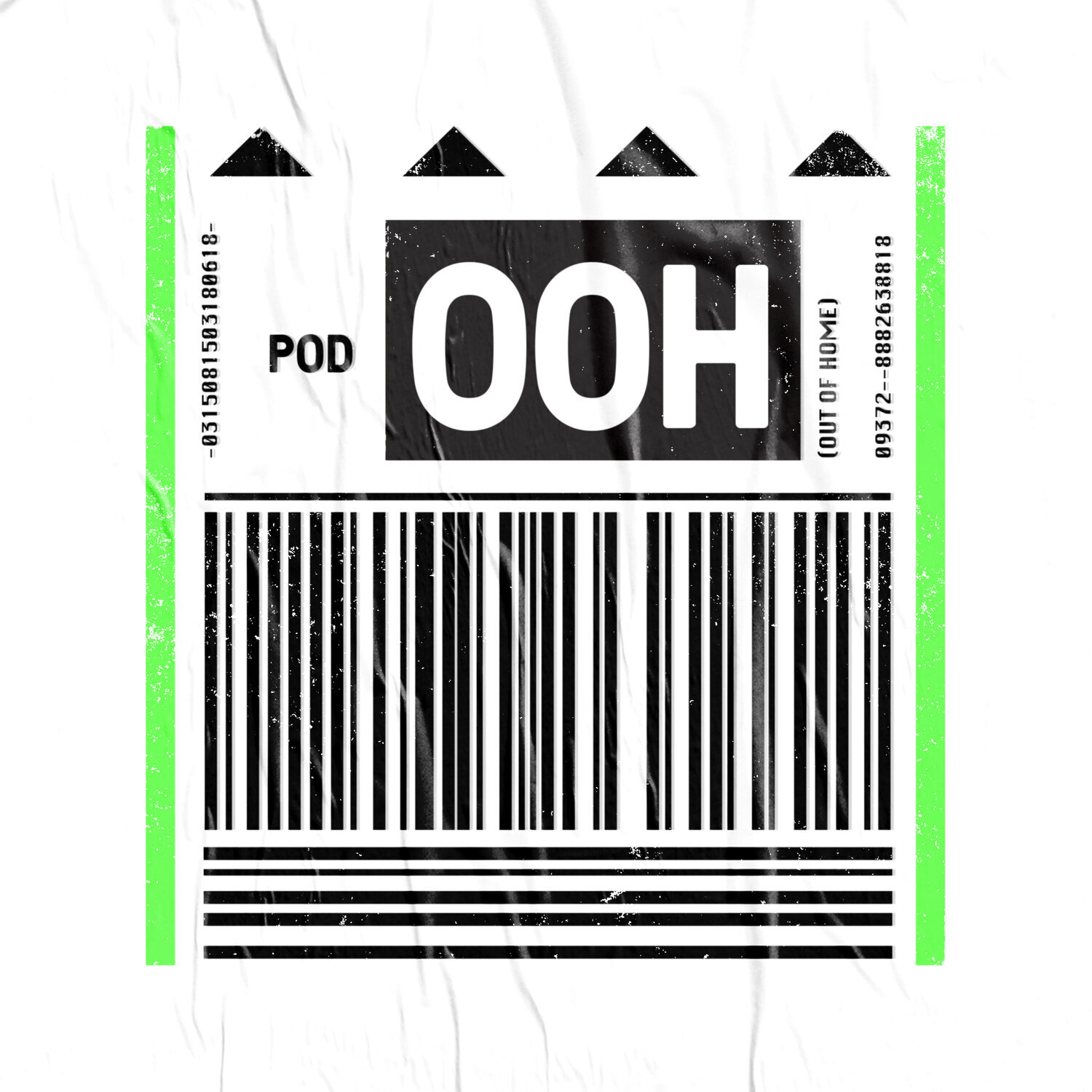
Focused on storytelling in all of their work, the brilliantly intuitive logo was designed by Jeff Lam, Art Director at Wieden + Kennedy and founder of Recess Amsterdam. Jeff’s aim was to visualise the journey the guys are on. Inspired by a luggage tag, there are personal touches and suggestions of a journey throughout. The dates each member arrived in Amsterdam are cleverly inserted into the logo, alongside visual cues of ‘home’ and ‘elevation’ represented by the four arrows.


